How to build a virtual QML keyboard
1. Introduction
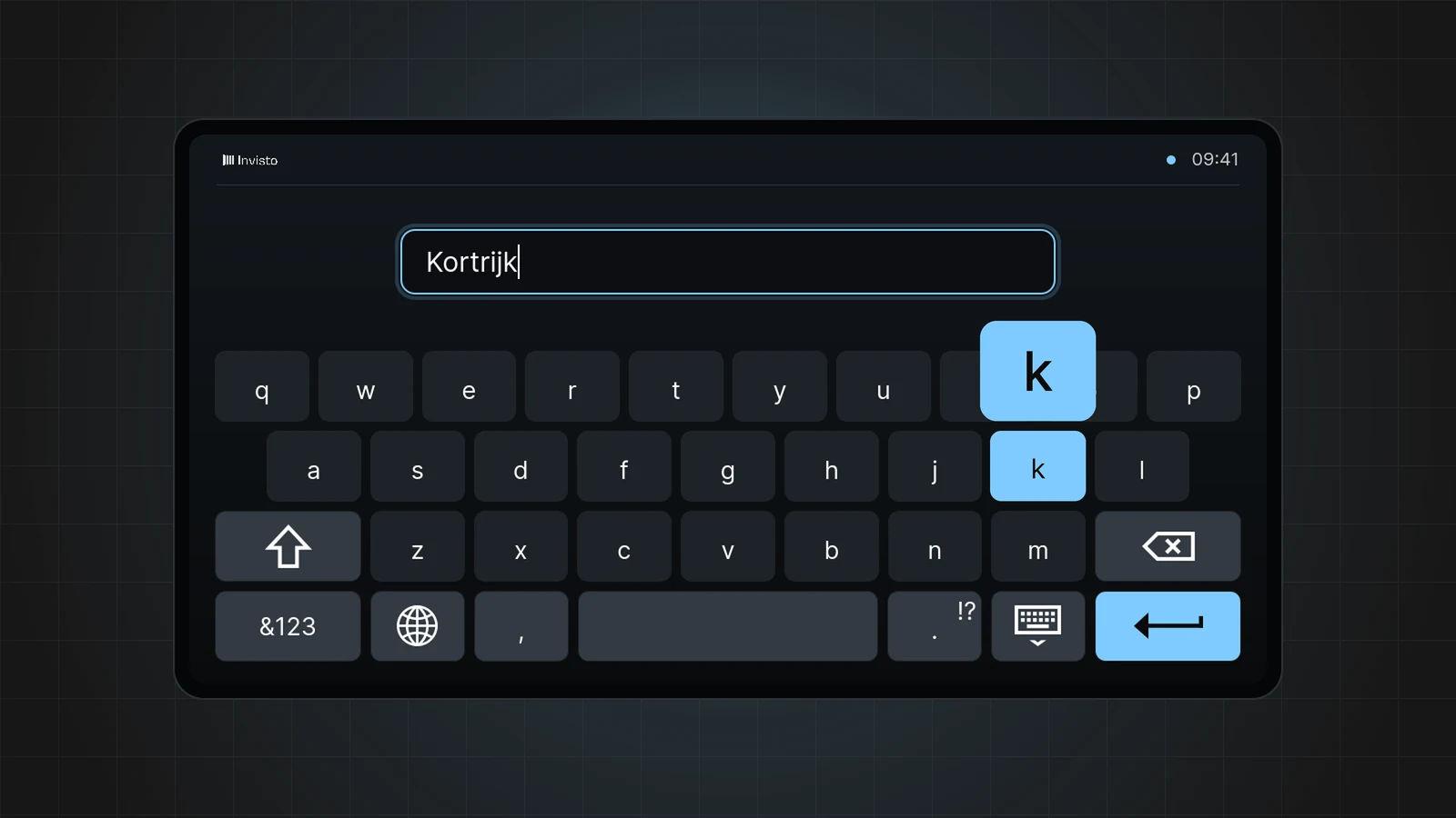
A virtual keyboard is needed when no physical keyboard is available. This is usually the case for electronic devices with a touchscreen.
There are several ways to add a virtual keyboard to a Qt application. Usually one of the following options is used:
- The Qt Virtual Keyboard
- The keyboard provided by the platform itself, such as the Apple keyboard on an iPad
- A custom-built QML keyboard
At Invisto we often go with the custom-built QML approach, because we do not want to impose any limitations on design or usability. It also helps that QML makes it very easy to reproduce a graphic design.
2. Keyboard
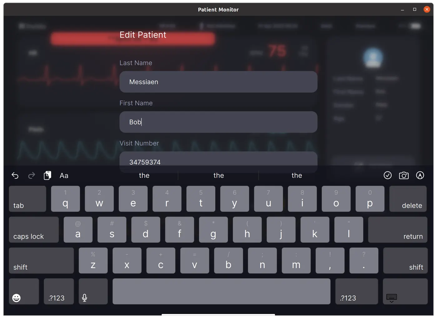
In this article we focus on a keyboard designed for editing patient information. We look at how to:
- Set up a basic keyboard layout
- Connect the keyboard to a text field
- Change keys dynamically when switching between lowercase and uppercase
2.1 Keyboard layout
For this application we do not need a responsive design: the screen dimensions are fixed.
import QtQuickimport QtQuick.ControlsItem { id: keyboardRoot width: 1194 height: 418 property var focusedTextField: null enum Modes { HIDDEN, ALPHABETICAL, ALPHABETICAL_CAPS, NUMBERS_1, NUMBERS_2 } QtObject { id: internals property bool singleShift: false } property int mode: Keyboard.ALPHABETICAL Item { id: keyboardHeader ... } Column { id: mainButtons Row { id: buttonsFirstRow ... } Row { id: buttonsSecondRow ... } Row { id: buttonsThirdRow ... } Row { id: buttonsFourthRow ... } } Rectangle { id: horizontalLine ... }}As you can see, we use a flexible grid structure by combining a column with several rows. Each row contains a set of keyboard buttons.
Row { id: buttonsFirstRow spacing: 12 KeyboardButton { dark: true width: 105 SingleLabel { text: "tab" } } ListModel { id: firstRowAlphabetical ListElement { first: "1"; second: "q" } ListElement { first: "2"; second: "w" } ... ListElement { first: "0"; second: "p" } } ListModel { id: firstRowAlphabeticalCaps ListElement { first: "1"; second: "Q" } ListElement { first: "2"; second: "W" } ... ListElement { first: "0"; second: "P" } } Repeater { model: keyboardRoot.mode === Keyboard.ALPHABETICAL ? firstRowAlphabetical : firstRowAlphabeticalCaps KeyboardButton { DoubleCharacters { first: model.first second: model.second } } } KeyboardButton { dark: true width: 105 SingleLabel { text: "delete"; alignLeft: false } }}Let’s take a look at how the buttons are built. In our scenario a button is simply a rectangle with some styling.
import QtQuickRectangle { id: root property bool dark: false color: dark ? "#45454B" : "#7C7C86" width: 82 height: 74 radius: 7 border.color: "#222" MouseArea { id: mouseArea anchors.fill: root onPressed: root.border.width = 2 onReleased: root.border.width = 0 }}To show the desired content on top of the button, we can add a child element such as SingleLabel, SingleIcon or DoubleLabel.
2.2 Connecting the keyboard to a text field
To demonstrate how a keyboard connects to an editable text field, we simplified our EditText.qml by removing unnecessary elements and keeping only the relevant parts. In essence it is a QML TextInput with some visual enhancements, with a MouseArea on top.
import QtQuickimport QtQuick.ControlsItem { id: root property string title: "" property string text: "" property alias cursorPosition: textInputField.cursorPosition width: 550 height: 88 TextInput { id: textInputField text: root.text color: "white" font.family: theme.fontRegular font.pixelSize: 18 anchors.verticalCenter: textBox.verticalCenter x: 27 } MouseArea { anchors.fill: root onClicked: { textInputField.focus = true keyboard.focusedTextField = root } }}What happens when you tap a text field?
- We give focus to our TextInput. This makes the cursor visible.
- We tell the keyboard which text field has received focus: keyboard.focusedTextField = root
What happens on the keyboard side when a button is pressed? The content elements (SingleIcon, SingleLabel, DoubleLabel) each call the function keyboard.handleButtonPressed(label). This handler takes care of actions such as adding or removing a character.
function handleButtonPressed(button){ if (button === "delete") { var str = keyboardRoot.focusedTextField.text if (str.length) { str = str.substring(0, str.length - 1); keyboardRoot.focusedTextField.text = str keyboardRoot.focusedTextField.cursorPosition = str.length } } else if (button === "caps lock") { if (keyboardRoot.mode === Keyboard.ALPHABETICAL) keyboardRoot.mode = Keyboard.ALPHABETICAL_CAPS else if (keyboardRoot.mode === Keyboard.ALPHABETICAL_CAPS) keyboardRoot.mode = Keyboard.ALPHABETICAL } else if (button === "shift") { if (keyboardRoot.mode === Keyboard.ALPHABETICAL) { keyboardRoot.mode = Keyboard.ALPHABETICAL_CAPS internals.singleShift = true } } else if (button === ".?123") { keyboardRoot.mode = Keyboard.NUMBERS_1 } else if (button === "return") { keyboardRoot.mode = Keyboard.HIDDEN } else { keyboardRoot.focusedTextField.text = keyboardRoot.focusedTextField.text + button keyboardRoot.focusedTextField.cursorPosition = keyboardRoot.focusedTextField.text.length if (internals.singleShift) { internals.singleShift = false keyboardRoot.mode = Keyboard.ALPHABETICAL } }}2.3 Switching between lowercase and uppercase
For each row we defined two models: firstRowAlphabetical and firstRowAlphabeticalCaps. Depending on the keyboard mode, we pass one of these models to the Repeater’s model property (see the snippet in 2.1).
3. Qt WebBrowser as a requirement? No pasaran!
The custom-built QML implementation described in this article falls short when you use HTML fields in combination with Qt WebBrowser. In that case the approach gets more complex, and you may need to look at QInputMethod, QPlatformInputContext, QPA and other components. That is outside the scope of this case, but worth mentioning.
4. Conclusion
A good-looking, functional keyboard that is fully tailored to your needs calls for a custom-built QML keyboard. This article is meant as an introduction to help you get started.
Need more information on this topic? Feel free to get in touch. We do not share the full source code here, because it is part of a project. We can always provide a working example if you would like one.